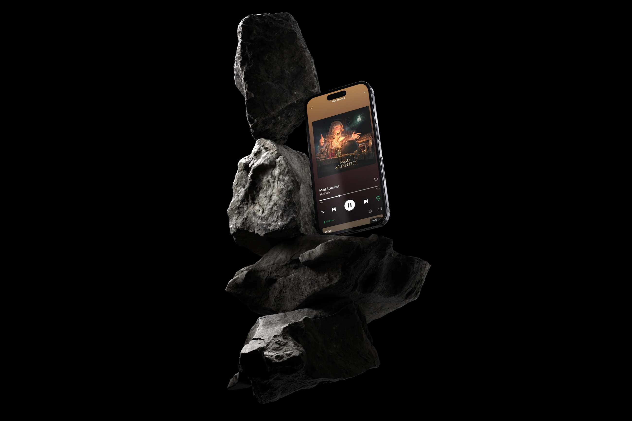
Mad Scientist is part of an ongoing visual universe built around the same character, world, and narrative. The goal was to show the character actively working with a newly discovered energy source, turning the original brief into a darker, more magical interpretation of an alchemist-scientist at work.
The project expanded beyond the cover itself into a complete album design package. I developed the visual direction, produced the main illustration, built custom typography, tested the composition in 3D, and adapted the final artwork for streaming platforms and social media.
Cover artIllustrationArt directionCustom typography3DSocial content
Client
My role
Designer and illustrator.
Concept development, illustration, composition, typography, 3D exploration, and platform adaptation.
Duration
Tools
3000×3000
Final master cover resolution in pixels
17
Assets delivered across the album package
Overview
The brief called for a grimy, dark, gothic, medieval environment where the character had finally found an energy source and was now using it to develop new spells and experiments. The initial direction included a run-down laboratory, tubes, vats, tools, chains, bloody hands, saws, pliers, and a reactor containing the energy source.
I kept the core narrative but reduced the number of decorative elements. Instead of filling the background with every requested prop, I focused the composition around the character, the energy source, and the working surface, creating a more complete and visually controlled scene.
Research and discovery
Before production, I explored several colour directions for the project. The moodboard compared six visual territories: Muted Lab Greens, Toxic Red Contrast, Industrial Warm Lab, Dark Arcane Science, Bio-Luminescent Lab, and Acid Green Environment. The final direction was Dark Arcane Science, built around deep shadows and concentrated luminous accents. The moodboard defined this route as a way to create a mysterious, high-energy atmosphere while using contrast to direct attention toward light sources.
The selected direction allowed the project to connect the medieval alchemist aesthetic with a more supernatural scientific atmosphere. Rather than treating the energy source as a generic sci-fi element, I used light, shadow, warm illumination, and surrounding darkness to make it feel like part of the character’s magical process.
Key decisions
I developed two sketch concepts for the composition. The second direction was selected and developed into the final artwork, giving the character a clear central role while keeping the working environment readable around him.
I used 3D exploration to determine the perspective, camera angle, and spatial relationship between the character and the surrounding objects. This helped establish a believable working surface and gave the final illustration a stronger sense of depth.
The original brief included hanging bloody hands and additional chains as background decoration. I intentionally removed these elements during refinement because they competed with the main action and made the composition feel less resolved. The final scene keeps the gothic and grimy character of the brief while using fewer elements more deliberately.
The title was customised from Cinzel Decorative rather than used as a default font treatment. I modified the letterforms into a custom title that integrates with the artwork and can function independently as a graphic asset, including potential merchandise applications.
What was delivered
The final 3000×3000 px master cover was prepared as the core artwork for the release. The image was refined for composition, lighting, colour balance, typography, and readability at smaller sizes.
The package was tested and adapted for different digital contexts, including social posts, Instagram Stories, profile presentation, streaming-style interfaces, and promotional placements. The same visual system was kept consistent across formats rather than treating each placement as a separate design.
The final package included 17 delivered assets, combining the main artwork with platform-specific adaptations and presentation materials.